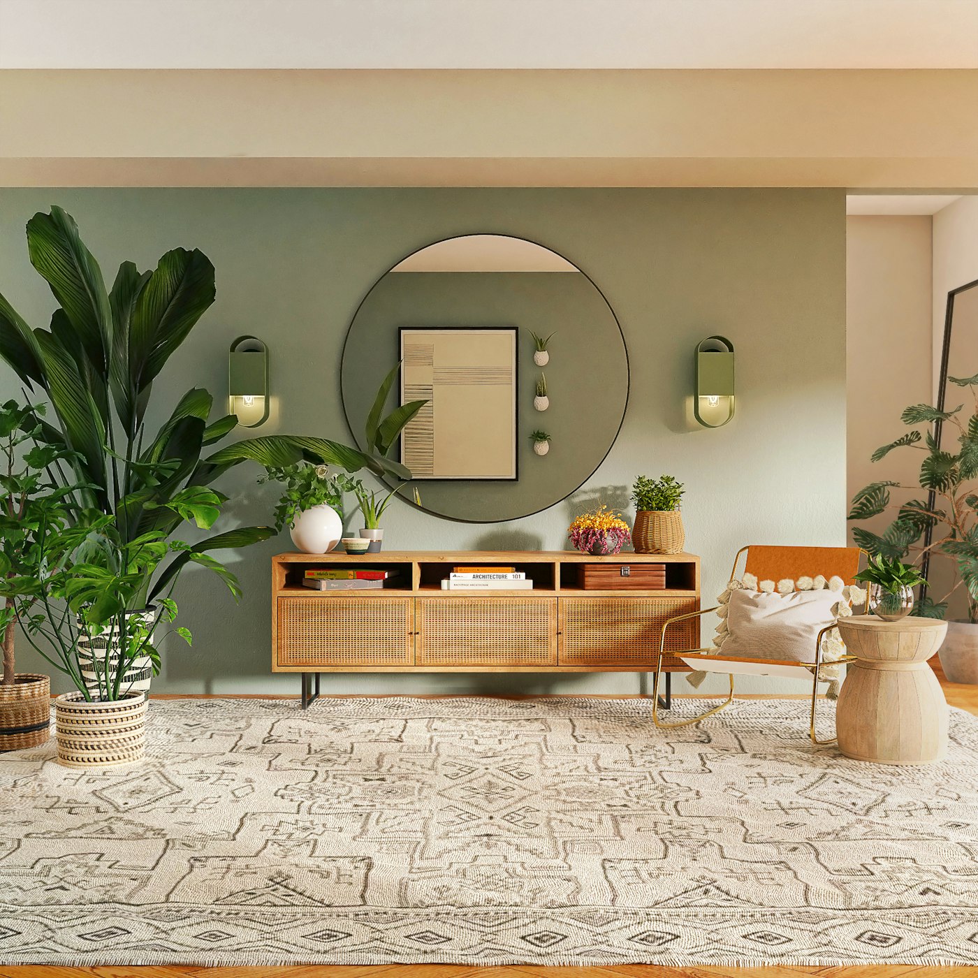
Paint is the cheapest way to change a room and the easiest way to get it wrong. Every year brings a new colour of the year, and every year a wave of rooms is repainted in a shade that will feel dated by the time the tin is empty. The alternative is not to avoid colour. It is to choose a palette that has somewhere to go.
A palette that ages well is built from three things: undertone, proportion and light. Get those right and the room will still make sense when the furniture changes, the children grow and the trends move on.
Start with undertone, not colour
Most “neutral” paints are not neutral. They lean warm (yellow, red, orange) or cool (blue, green, violet), and that undertone decides how the colour behaves next to wood, stone and fabric. A greige with a green undertone will look muddy beside oak; the same greige with a pink undertone will glow.
Our rule is simple: choose the undertone first, the depth second, the name last. Paint names are marketing. The pigment is the fact. Farrow & Ball's colour resources are useful precisely because they show undertones side by side rather than one hero shade at a time.

The 60–30–10 rule, translated
Designers often describe a room as sixty percent dominant, thirty percent secondary and ten percent accent. In practice that means: walls and large surfaces set the mood, upholstery and curtains support it, and a small amount of a deeper tone gives the eye a place to land. When a room feels restless, the proportions are usually the problem, not the colours themselves.
Keep the accent for things that are easy to change — cushions, a lamp, a ceramic bowl, a single chair. That way the expensive decisions stay quiet and the seasonal ones stay cheap.
Five tests before you commit
- Paint a large sample board and move it around the room at different times of day.
- Look at it beside your flooring — the largest permanent surface in the room.
- Check it at night under the lamps you actually use, not just daylight.
- Test the trim colour at the same time; a warm white trim can rescue a cool wall.
- Buy one test pot, not five. Two coats on an A3 board tell you more than a fan deck.
Let materials set the temperature
The most durable palettes are not really paint palettes at all. They are material palettes: oak, limestone, linen, plaster, aged brass, wool. Colour sits on top of those surfaces and borrows their warmth. This is why a room with beautiful materials can carry a bolder wall colour than a room full of painted MDF.
If you are building a palette from scratch, begin with the materials you love and let the paint respond to them. Our essay on natural materials that get better with time shows how stone, timber and linen shift the temperature of a room without a single trend colour.
Then live with the samples for a week. The right palette is the one you stop noticing — and that is the highest compliment a colour scheme can receive.

